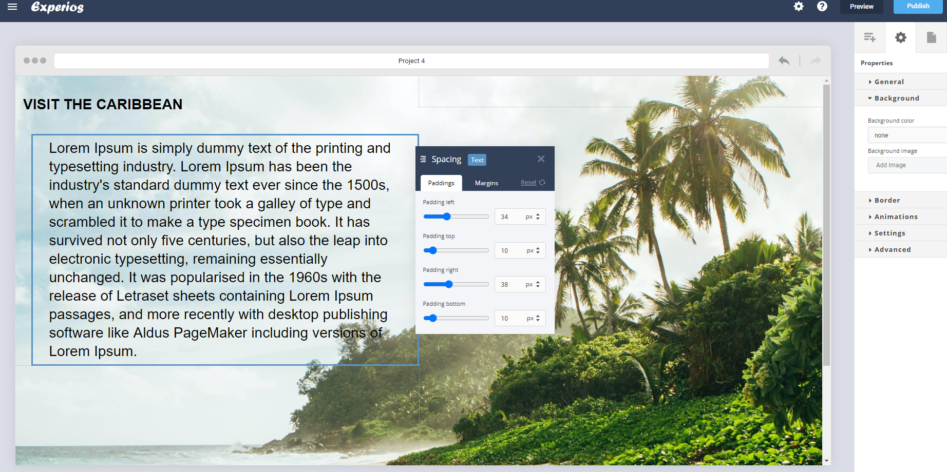
The use of padding and margins is a great way to position your text in the perfect position. Click on the Indent option in the text editor to access the dialog box.
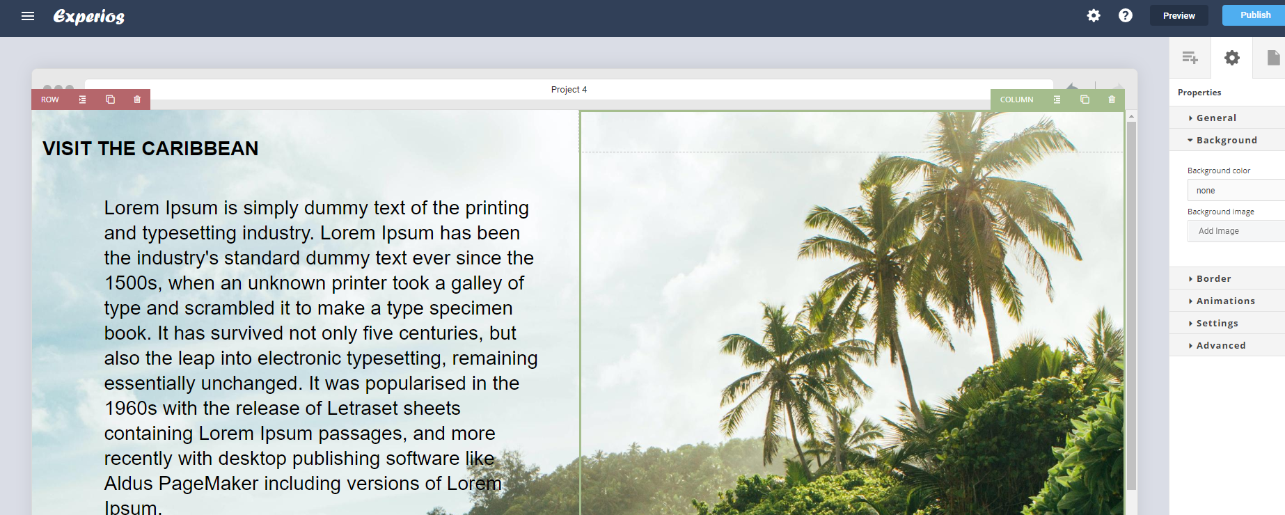
In this example, to position the text over the beach – and away from the trees – we first added a spacer block from the features section of the content tab. Then, to adjust where the text starts and finishes within the text field, we changed the padding values.
Most of the time, a combination of spacers and padding works best. These are automatically removed for mobile resolutions to give optimal content layout. Padding is less likely to cause elements to wander off the screen. While margins offset objects so they can end up out of view.


