In Experios, images are configured by default to have no margins or padding on mobile devices. This is because of how we stack things responsively on narrower screen widths, with images tending to take up the available horizontal space. This means that, in the case of smaller images, you might find them attaching themselves to the left-hand side of the screen.
In these cases, the way to create space between the element and the side of the screen is to apply padding to the containing element (normally a column, but you could also apply it to the column’s parent row).
If You are Using Experios Developer Tools
If your subscription includes access to Experios Developer Tools, you can add an additional CSS class to your image to remove the no margin/padding on mobile devices behaviour.
To do this:
- Ensure that your user account role is set to ‘Expert’. If not, your team leader can change it using the ‘My Team’ section of the Experios dashboard. If you are logged in when your role is changed, you will have to log out and back in again to see the Expert account options.
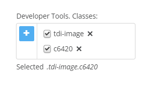
- Enable Developer Tools by opening Project Settings, selecting the ‘Advanced’ tab, and checking the box next to ‘Enable Developer Tools’. This will reveal the ‘Classes’ panel at the bottom of the Properties column to the right of your canvas. When an element is selected, this should look something like this:
- Click on the plus sign icon and enter the following in the text box that appears:
tdi-no-zero-margins - Margins assigned through element properties should now apply across all screen sizes.
