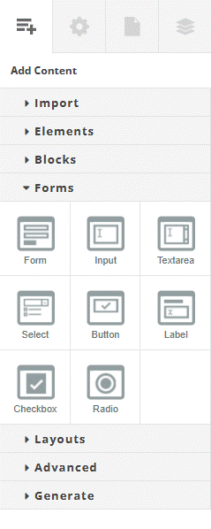
When you add a form to an Experios, it will initially contain a default set of text fields for a user to submit their name, email and a message. After a form has been added, the Forms section of the Add Content Control Column will display a set of elements which allow for your form to be customized using common form fields. These elements are:
- Input
- Textarea
- Select
- Button
- Label
- Checkbox
- Radio
You can build your custom form by dragging these elements into your form element and configuring them appropriately. Form elements are configured using the Settings section of the Properties Control Column. Configuration for each element is as follows:
Input
- Name – This is used to process the field when the form is submitted. Form fields must each have a unique name.
- Placeholder – The text you want to display in the input field before a user enters their own.
- Type – Ensure that a user enters valid information using this. The type of an input can be text, email, password or number. Text will allow any set of characters to be entered. Email will force a user to enter a correctly formatted email address before the form can be submitted. Password will obfuscate entered characters using filled dots (•). Number will allow entry of digits only.
- Required – Check this box to force a user to fill in this field before submitting the form.
Textarea
- Name – This is used to process the field when the form is submitted. Form fields must each have a unique name.
- Placeholder – The text you want to display in the field before a user enters their own.
- Required – Check this box to force a user to fill in this field before submitting the form.
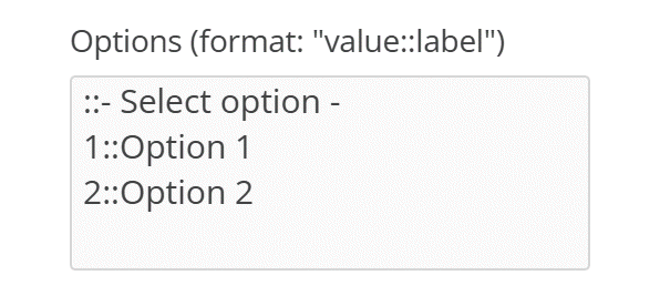
Select
- Name – This is used to process the field when the form is submitted. Form fields must each have a unique name.
- Options – Each option you want to appear in the select dropdown. Options should be entered, one per line, in the format value::label. The value is the data that will be submitted with the form, whereas the label is the text that the select field will display to users.
The value selected by default will be the first form element. To include an option with no value at the top of the options, begin the line with ::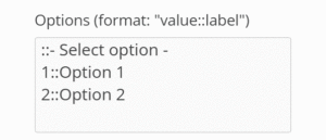
Select Box Options - Required – Check this box to force a user to fill in this field before submitting the form.
Button
- Text – The text that will be displayed on the button.
- Type – The purpose of the button. Possible values are:
- Submit – The button submits the form.
- Reset – The button clears all form fields.
- Button – A generic button. Behaviors can be added using, for example, Javascript.
Label
- For – Specifies which form field the label is attached to. Must exactly match the Name of the intended field.
- Text – The text for the label to display.
- Layout For – Change the layout of the label to appear above a form field (input) or to the left of the field (checkbox).
Checkbox
- ID – This is used to associate the checkbox with a label, and must exactly match the For field of the checkbox’s label.
- Name – This is used to process the field when the form is submitted. Form fields must each have a unique name.
- Value – The value to be passed if this checkbox is selected when the form is submitted.
- Required – Check this box to force a user to fill in this field before submitting the form.
- Checked – Select this if you would like the checkbox to appear checked initially.
Radio
Radio buttons function in groups, with only one button from a group selectable at a time.
- ID – A unique id for each button.
- Name – All radio buttons within a group must have the same Name in order to function as a group.
- Value – The value to be passed when the form is submitted.
- Required – Check this box to ensure that a user selects this radio button before submitting the form.
- Checked – Select this to have this radio button selected initially.