 Speaking from a graphic designer’s perspective, here are some tips for flipbook designs that should always be incorporated into your digital publication. Many of these tips should be applied during the creation of your publication; this is usually through InDesign or other similar design applications. Then save the publication as a PDF, import into the 3D Issue software and compliment your existing design by the addition of interactivity to your flipbook.
5 Flipbook Design Tips
Prioritize the esthetics:
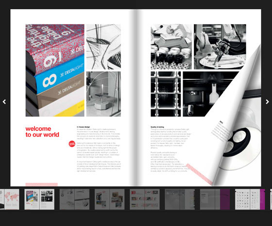
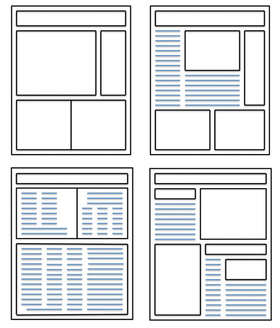
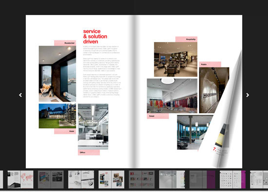
You must allow the eye to feel comfortable. The rules of composition apply at this point; lead the eye in, break up the page into a grid. You can utilize templates, pick a template style and incorporate it throughout the publication. To diversify the content, you can juxtaposition the images and text on alternate pages, the base grid underneath will remain constant, hence allowing your design to flow. This brings familiarity to the publication – thus creating trust and ease within the reader.

Color coordinating:
Pick a pallet and remain loyal to a few colors. Structured this way and all the colors will not be vying for attention at one time – which is a downside of trying to use too many ‘strong’ colors in the one publication.

White space:
Minimalism is in! Just have a look at Apple’s Website. Strive for order and tidiness over clutter and overcrowding.
Click on the image below to launch the flipbook on whatever device or computer you are on:
Image & photo selection:
You are the art director! Be a good editor, if images are pixilated or low resolution leave them out. The best-designed publication will fall at the first hurdle if this is not observed; there is nothing worse than leafing through a well-designed piece and coming across a poor image. It screams I don’t care. Photoshop has lots of filters on offer. This is not a pre-requisite to feel that you have to use them. Some are not fashionable anymore, they will date your publication within seconds. Current trends are a slight “drop shadow” or a “reflection”. As with all trends, stay aware of what is contemporary and don’t go over the top with this approach as your publication, however well designed can date very quickly.
Break up the text:
It can be a drag to the reader to have to read large sections of text. There are different ways you can make this more pleasurable and acceptable to your audience. You can manipulate images, graphs, bullet points etc. This will enable the reader to have a much more agreeable reading experience and not be overawed by the amount of text presented to them. This way the bulk of the text will be divided into readable sections. Couple this with well thought out images and design features and you will appease the reader and encourage them to read further.
Enjoy the 3D Issue software: We encourage you to experiment with your flipbook’s design. Make modifications that enhance your brand. This will strengthen your identity and online presence. The effort you put in will reap rewards. Use the software to its full capabilities and you will see that such an approach is what can set your flipbook apart. You can try now if you have a PDF prepared. The FREE trial is fully functional for 14 days.
I hope you found today’s blog interesting in your quest to find inspiring flipbook design tips. If you any questions please email us at info@3dissue.com.
By Audrey Henry


